Advantage Strength & Conditioning
CREATING AN IDENTITY FOR ANN ARBOR’S MOVEMENT AND PERFORMANCE SPECIALISTS
BRAND IDENTITY
Project Background:
When former Chicago Wolves defenseman Brian Sipotz decided to take his skill to the next level and open Advantage Strength and Conditioning in Ann Arbor, Michigan in 2012, he needed an identity to match his ambition and vision. He was determined to connect heart and mind with physical strength for athletes of all ages.


Results:
Much like Sipotz’s vision, the Advantage graphic strives to connect the mind and body. The gym isn't focused on just one aspect of training, instead it's strength + conditioning + nutrition + discipline + focus + the will and more. So we wanted a way to emphasize that connection in the graphic component of the logo.
“IT’S VERSATILE, IT’S UNIQUE AND I FEEL GOOD ABOUT WHAT IT REPRESENTS. I LIKE THAT THE LOGO CAN BE SEPARATED. THE WORDING LOOKS SOLID AND STRONG, AND THE ICON IS MORE FLOWING. THAT IS REALLY COOL.”
The plus sign is formed by the interconnected strength of the “S” and “C” of Advantage Strength and Conditioning, punctuated with a subtle heart shape - symbolic for the athlete giving his/her all, including heart in performance.
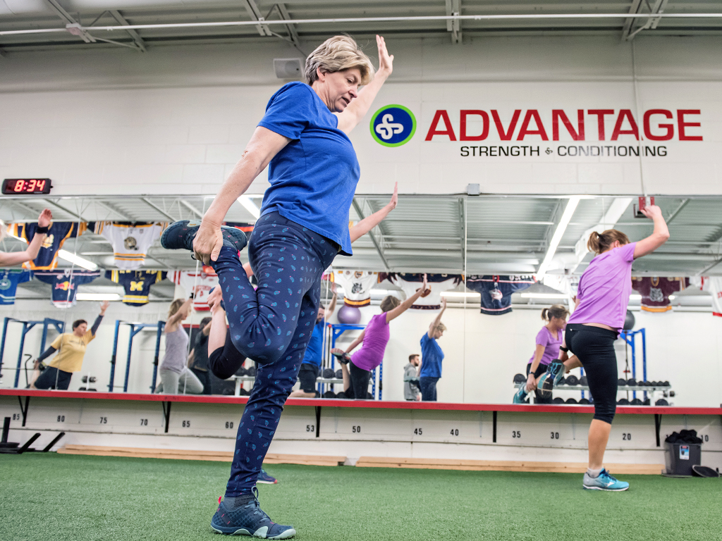
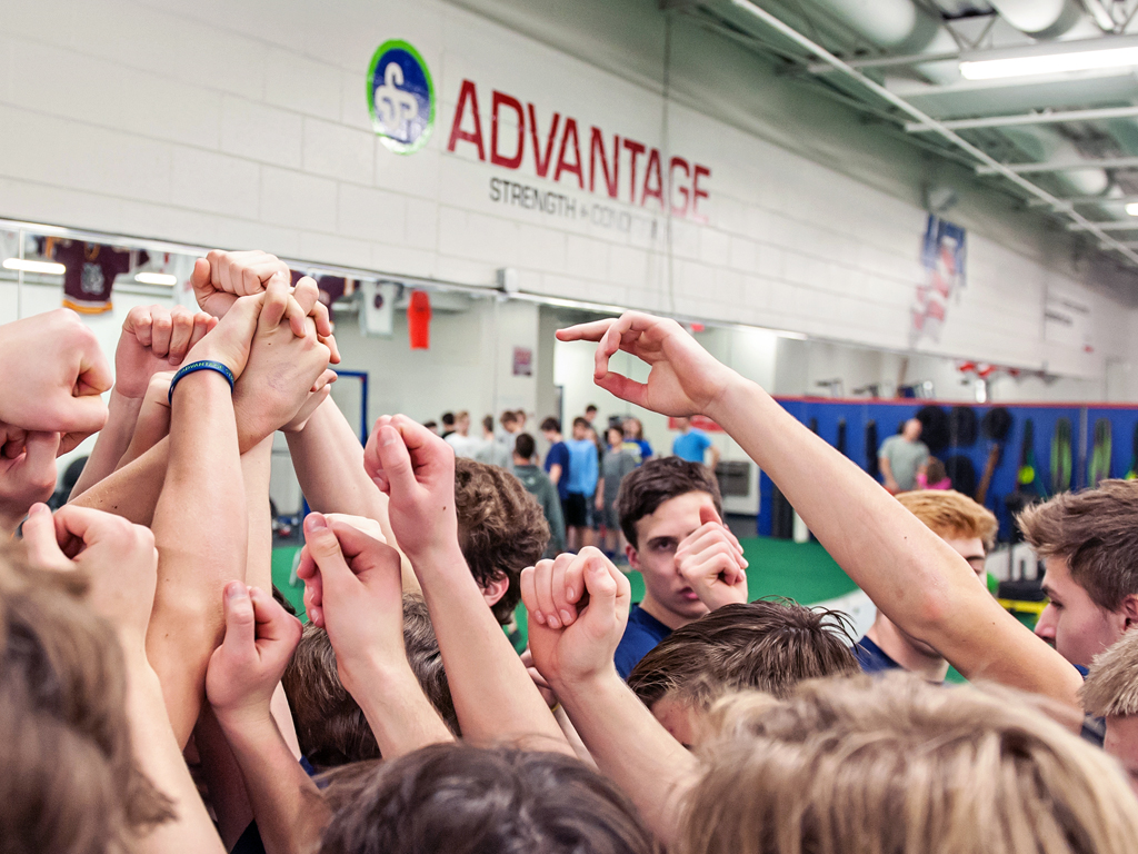
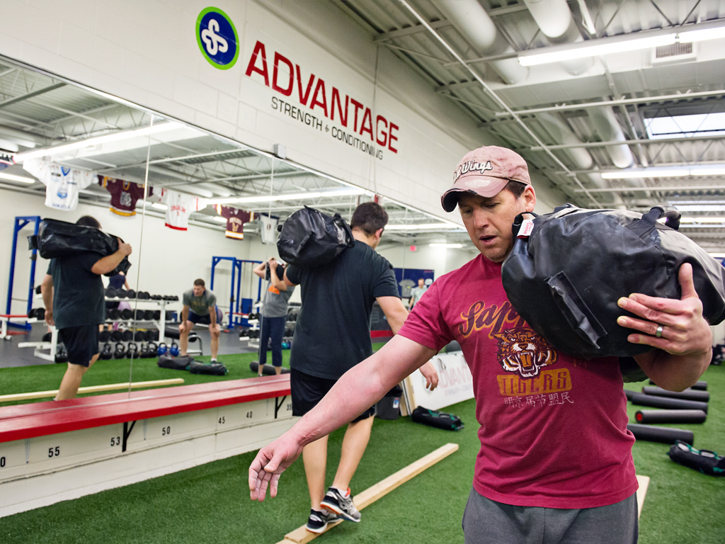
Since opening in 2012, Advantage Strength and Conditioning continues to grow its successes with expanded space, staff and clientele.
Deliverables:
Identity Development
Primary and Subrand Logos
Stationery Kit
Images courtesy of Advantage Strength & Conditioning